Case Studies / McLean, Virginia
A home reshaped around light.
A kitchen moved toward the garden. A bathroom opened to the trees. Across this McLean home, a new plan brought daylight, useful storage and a more natural flow to everyday life.
The designer’s walkthrough
See the plan come together.
The designer-led tour explains the decisions behind the finished rooms. Below, the original photographs and construction stages show how those ideas became part of the house.
- Kitchen relocation & structural opening
- Living spaces, home office & foyer
- Mudroom, upstairs laundry & primary bath
The starting point
Give the kitchen a better place in the house.
The original kitchen sat toward the center of the home, close to the staircase and away from the larger exterior windows. It was small in relation to the surrounding spaces, while rooms with better access to daylight were serving more formal uses. Changing cabinet finishes alone would have left that imbalance in place.
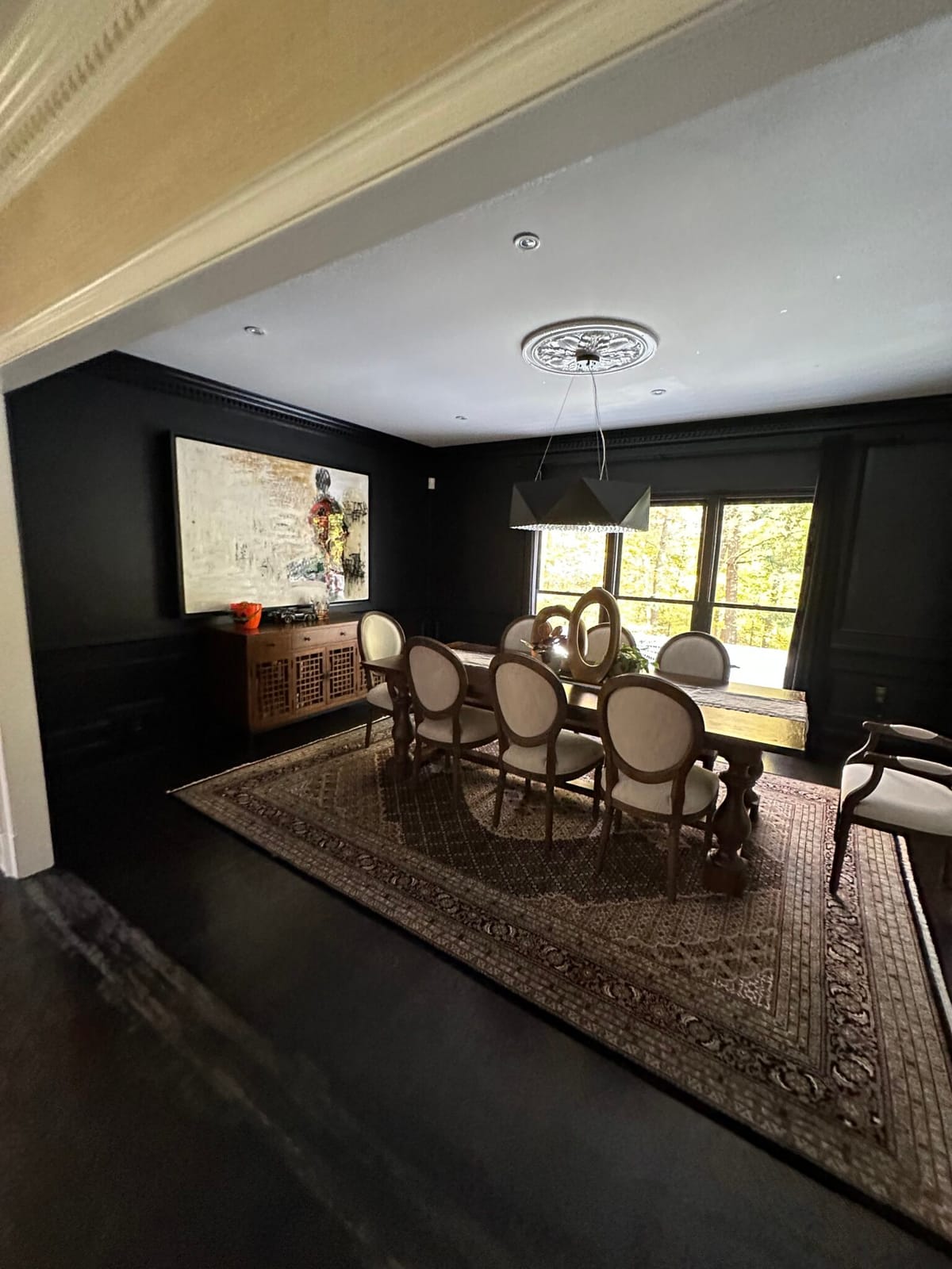
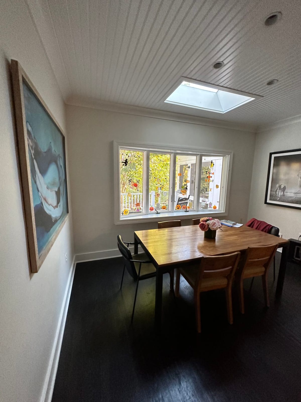
The plan moved the kitchen into the former dining room, toward the garden-facing side of the house. The old kitchen location became a bar, and an underused living area was reassigned to dining. Rather than treating each room as a separate decorating exercise, the renovation reconsidered where daily activities belonged.
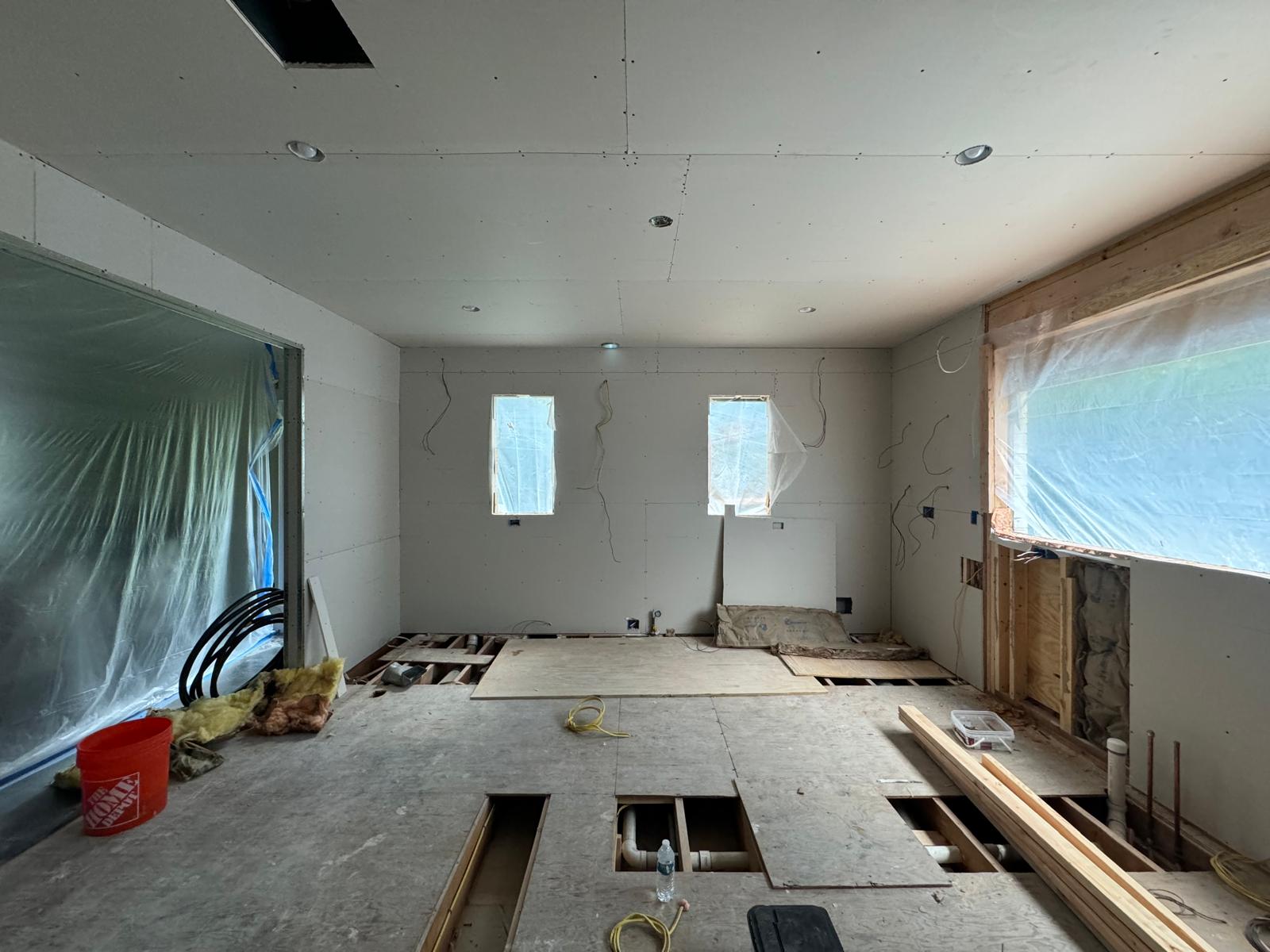
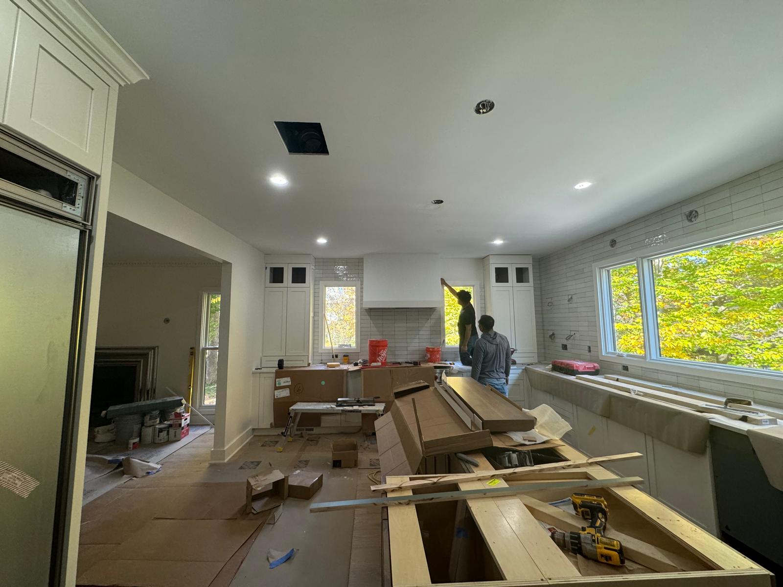
That shift required opening a load-bearing wall and installing a structural beam. The construction photographs reveal the scale of the intervention: exposed framing, opened floors and a broad connection between the new kitchen and the rooms beyond. In the finished space, the beam is wrapped in wood, making the structural change part of the interior.
Before
After
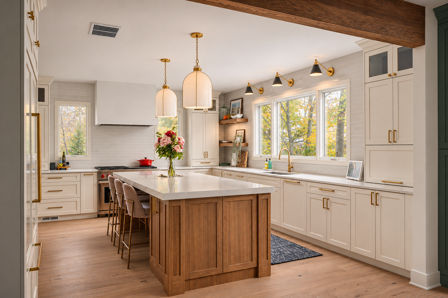
The former dining room and the new kitchen are shown from different viewpoints. The room’s use and its relationship to the adjoining spaces both changed.
During construction
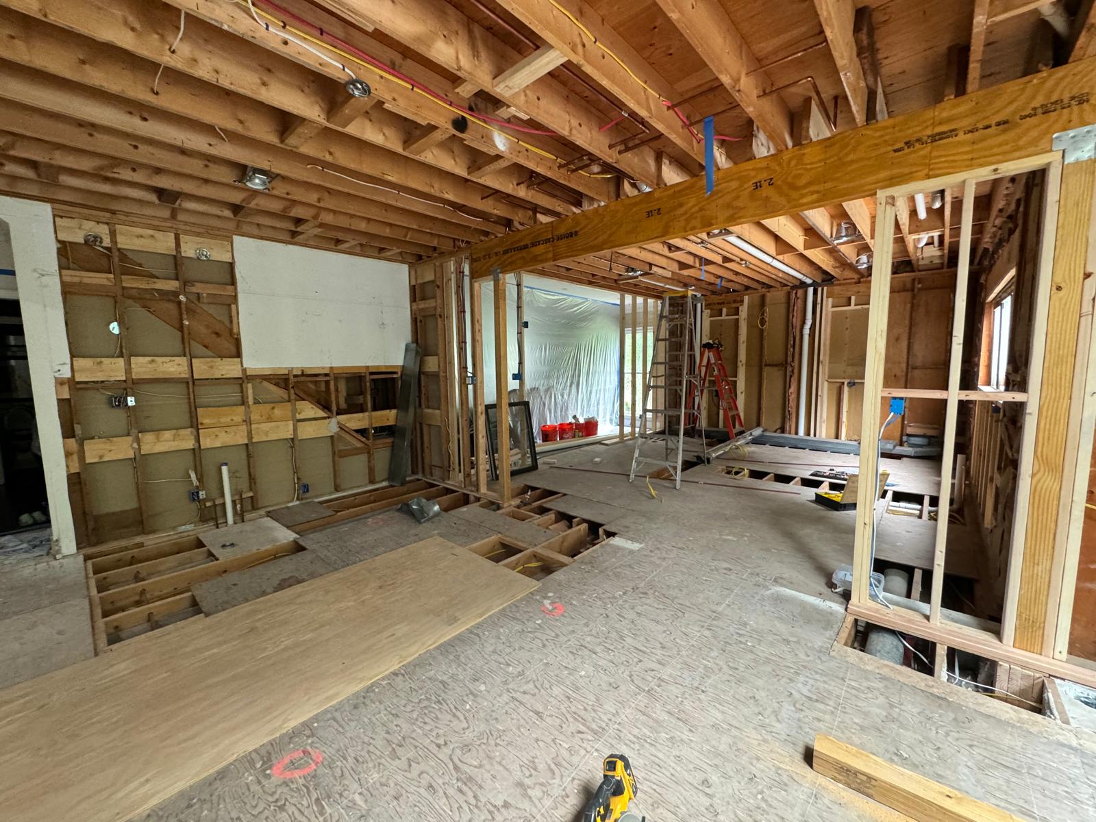
During construction
Kitchen & daylight
Let the windows lead the design.
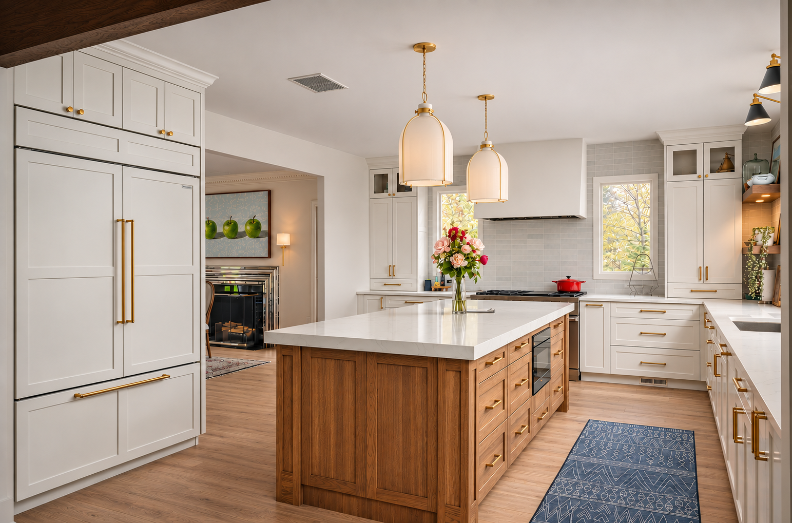
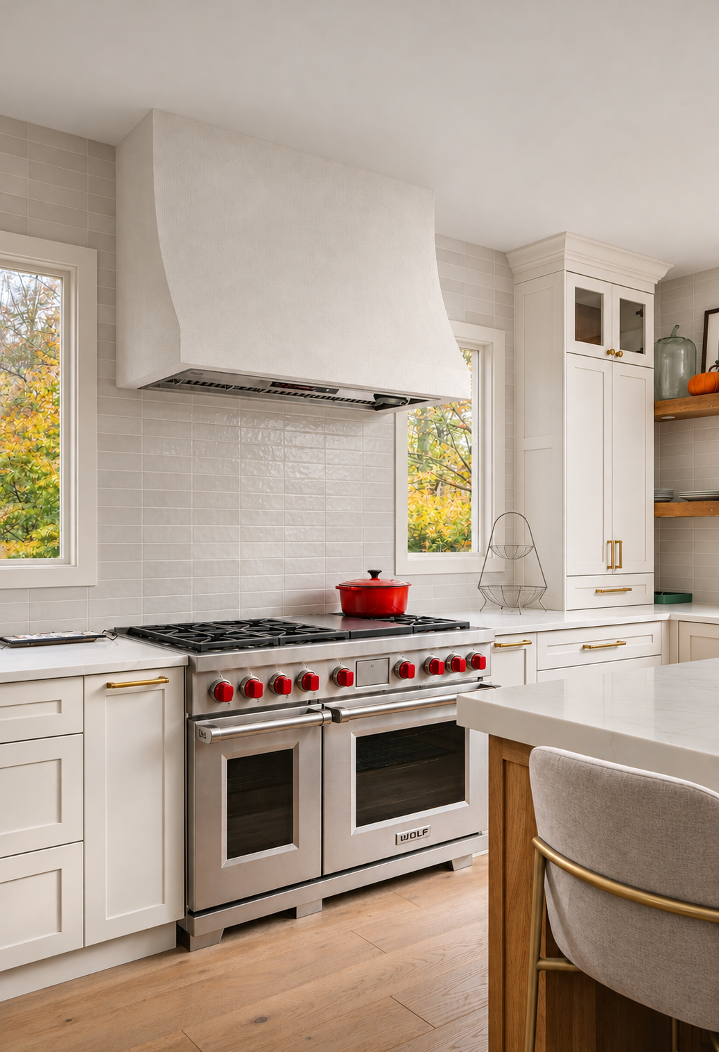
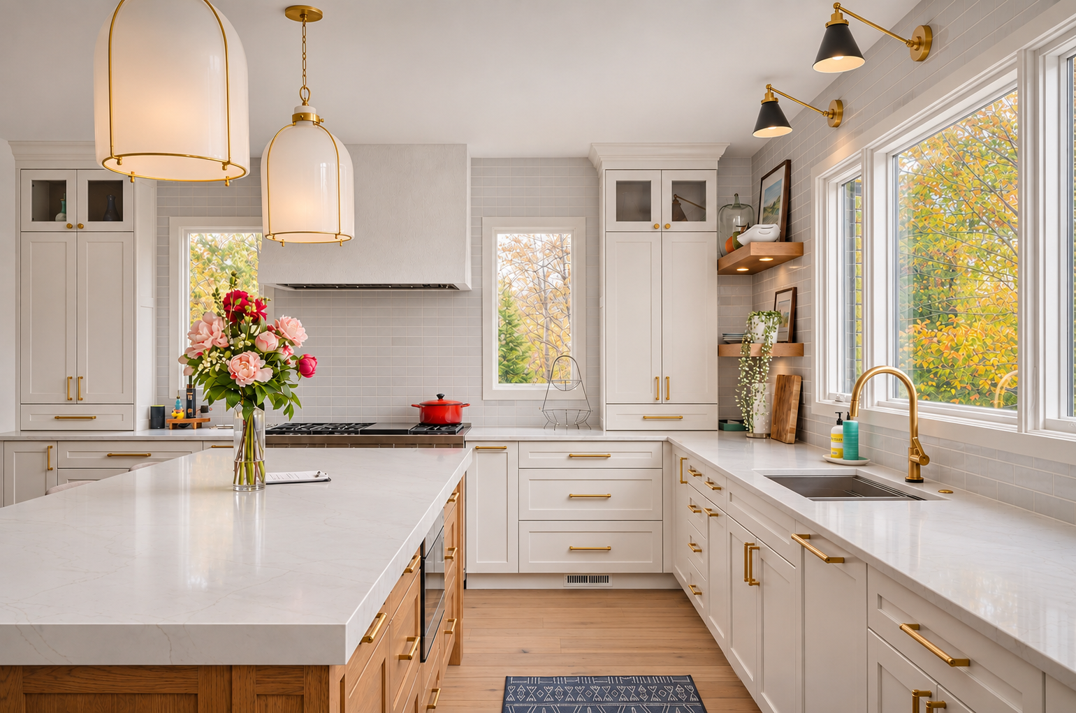
The new kitchen uses the long garden-facing window as an everyday outlook from the sink. Two additional windows flank the range hood, bringing daylight from a wall that previously had no windows. Their symmetry gives the cooking wall an orderly composition without making the hood the only point of interest.
A textured plaster hood was chosen to sit quietly within that composition. With a wood island, warm flooring, brass-toned hardware and green cabinetry visible in the neighboring room, another strongly contrasting object would have competed for attention. The plaster adds depth through its surface, while its pale color keeps the windows and their changing view prominent.
The island anchors the room with storage on the working side and seating on the other. Pale perimeter cabinetry and the broad, light countertop balance its wood finish. The paneled refrigerator joins the tall cabinetry, while open shelves near the sink offer a smaller-scale place for objects and daily essentials. These different elements give the kitchen variety within a clear material palette.
During construction
After
After
After
Bar, dining & living
Connect the rooms without making them identical.
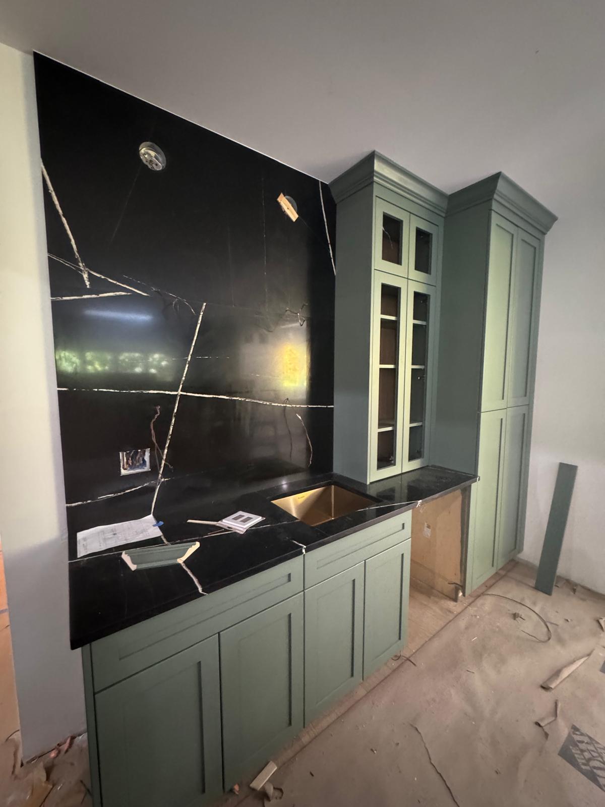
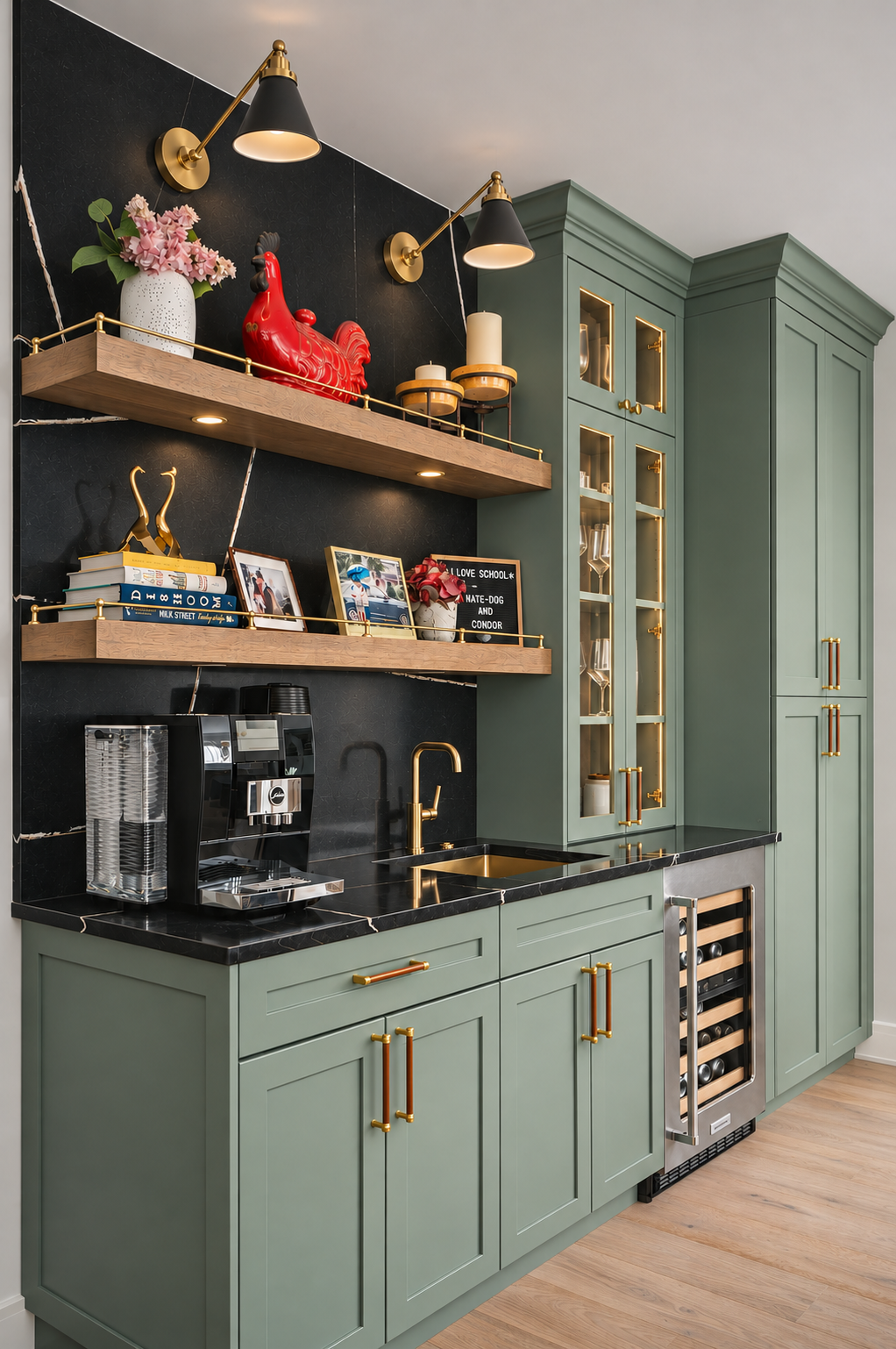
Moving the kitchen created an opportunity to give its former position a new role. The green bar combines a sink, beverage storage, tall cabinetry and open wood shelves against a dark backsplash. It serves the adjoining gathering spaces, so drinks and coffee have their own destination outside the main cooking area.
The dining and sitting areas share the green cabinetry, but the kitchen remains predominantly pale. Wood provides continuity across that change: the island, exposed beam wrap, shelves and selected cabinet backs repeat a warm tone. The rooms can have distinct colors and still read as parts of the same renovation.
The window-side nook is a good example of the changed priorities. Previously furnished with a dining table, it now holds two lounge chairs between tall display cabinets. Together with the new dining arrangement and the family room beyond, it creates several places to gather rather than concentrating every activity around the kitchen island.
Before
After
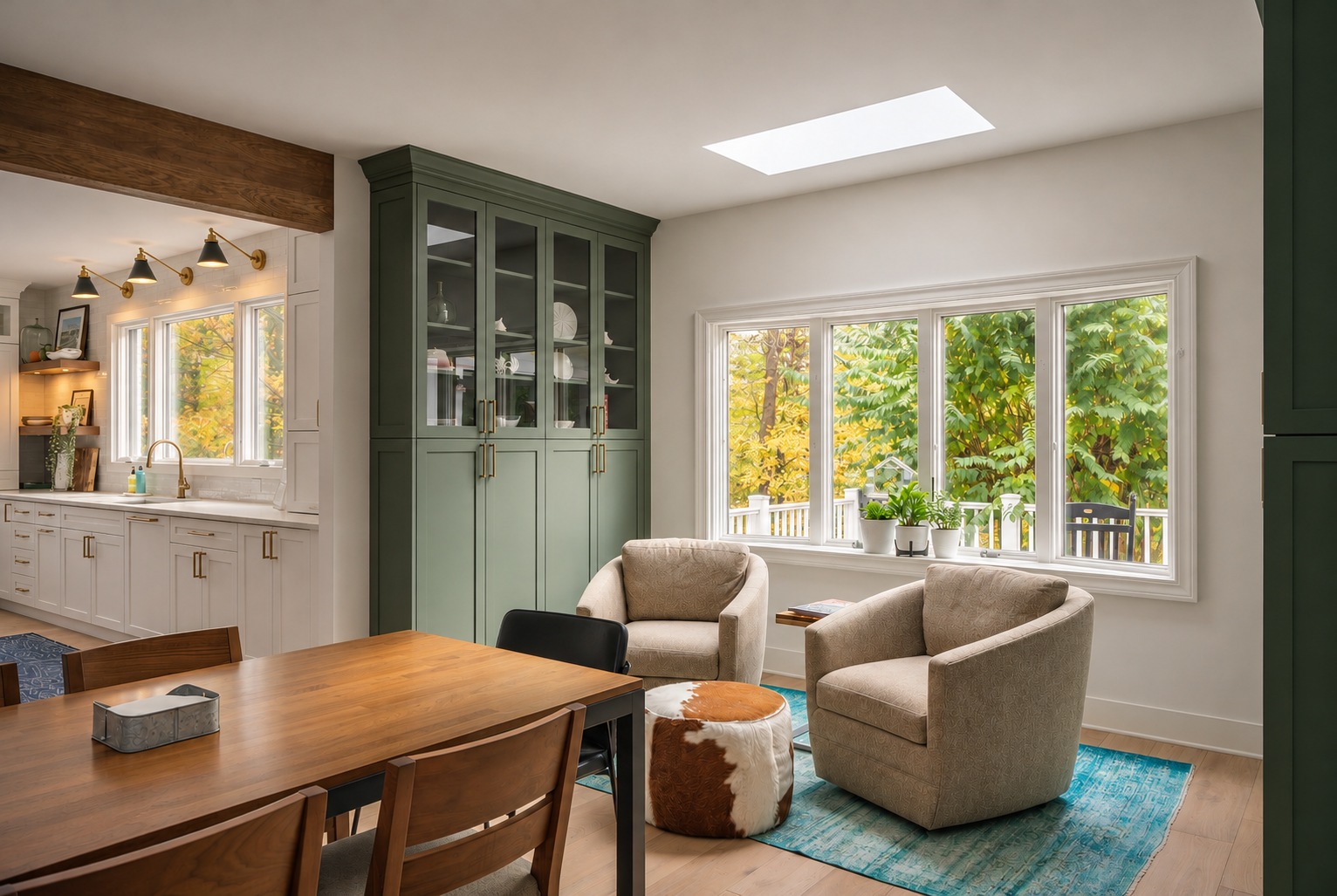
The window and skylight identify the same nook; the photographs show it from different angles.
During construction
After
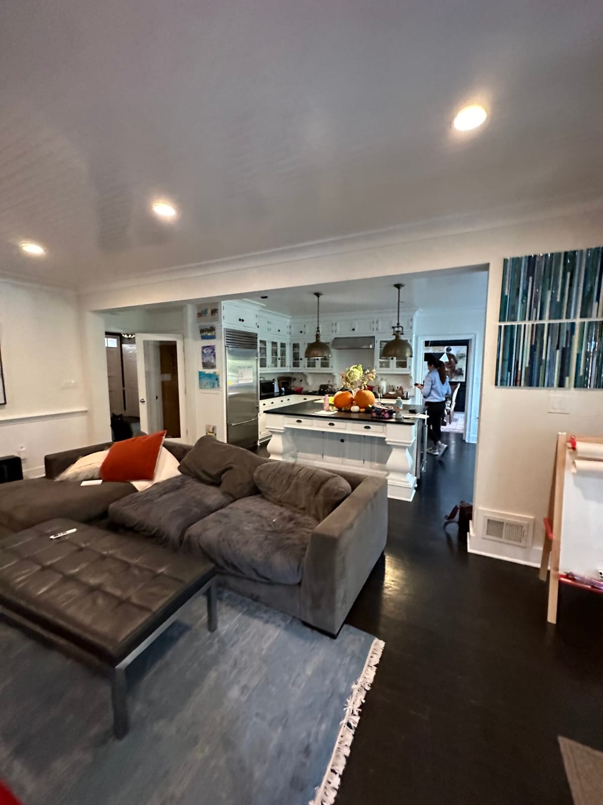
Before
After
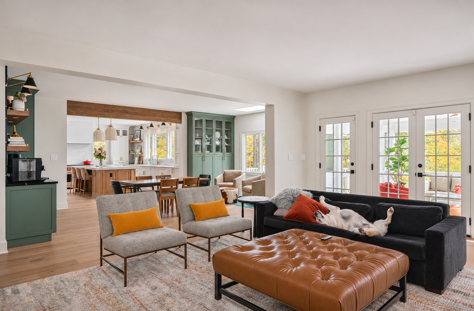
Views from the family-room side show how the sequence of rooms changed.
A place to settle
Give the family room its own focal point.
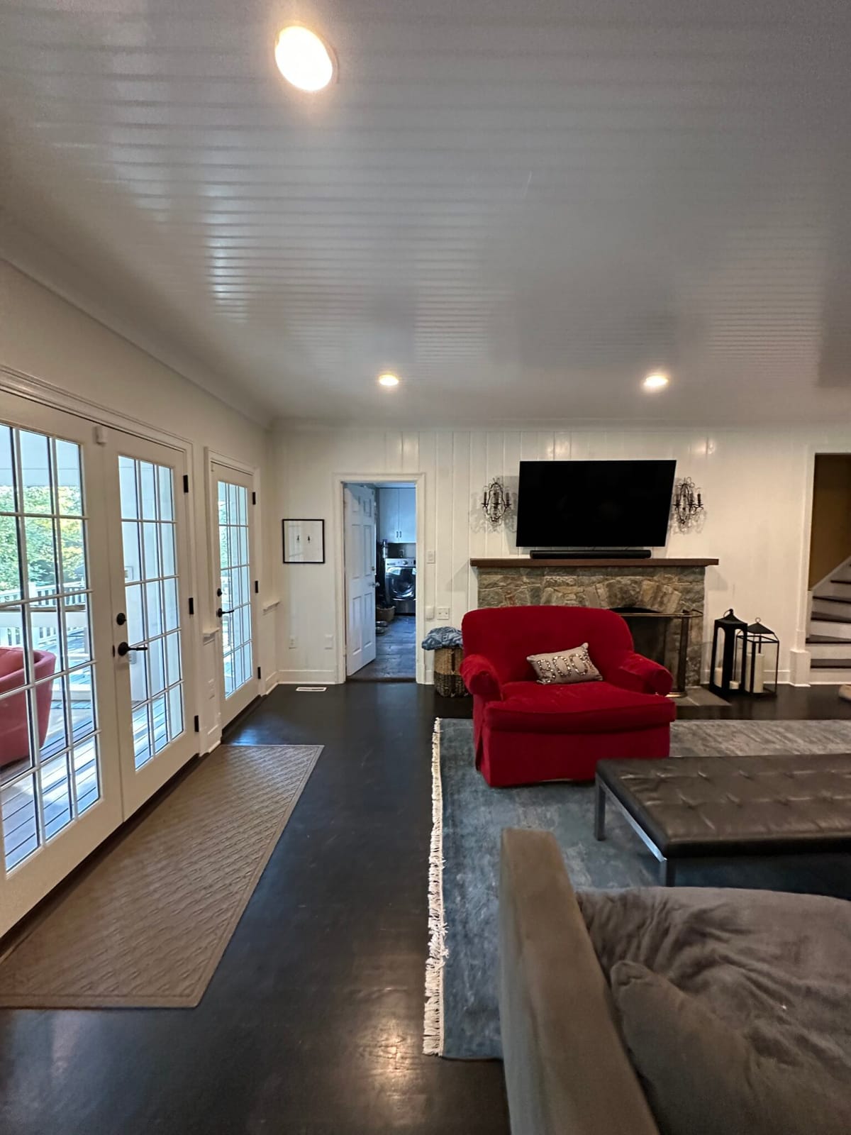
Opening the plan did not remove the need for a distinct family room. The fireplace gives that space a strong center, visible within the larger arrangement but with a material character of its own.
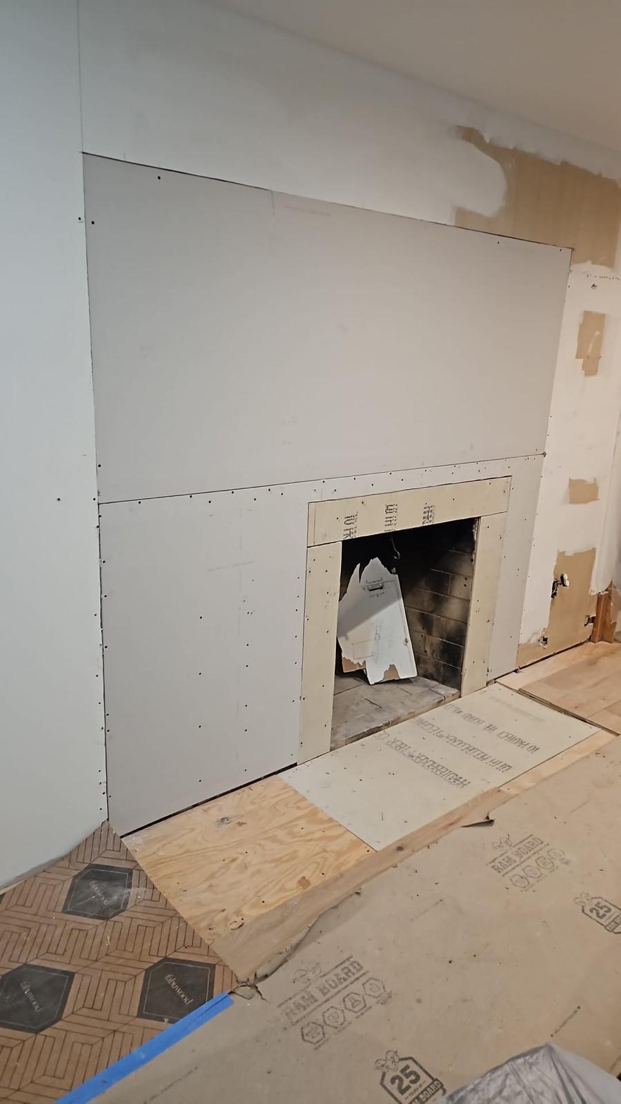
Brown paneling, black quartz stone and a pair of sconces establish the fireplace wall without repeating the green cabinetry yet again. The darker surround frames the firebox, while the tall panel above the mantel draws the composition upward. It is a different treatment from the kitchen and bar, held together by the same attention to warm surfaces, dark accents and layered light.
Before
After
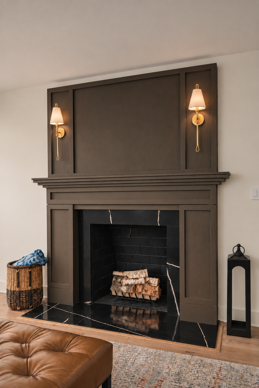
This comparison focuses on the fireplace wall; the after photograph is a closer view.
During construction
Work & arrival
Make the supporting spaces feel considered.
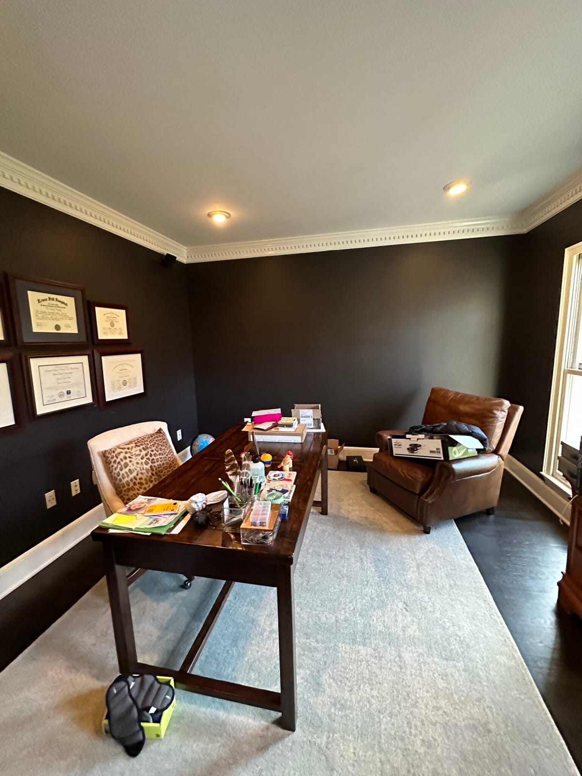
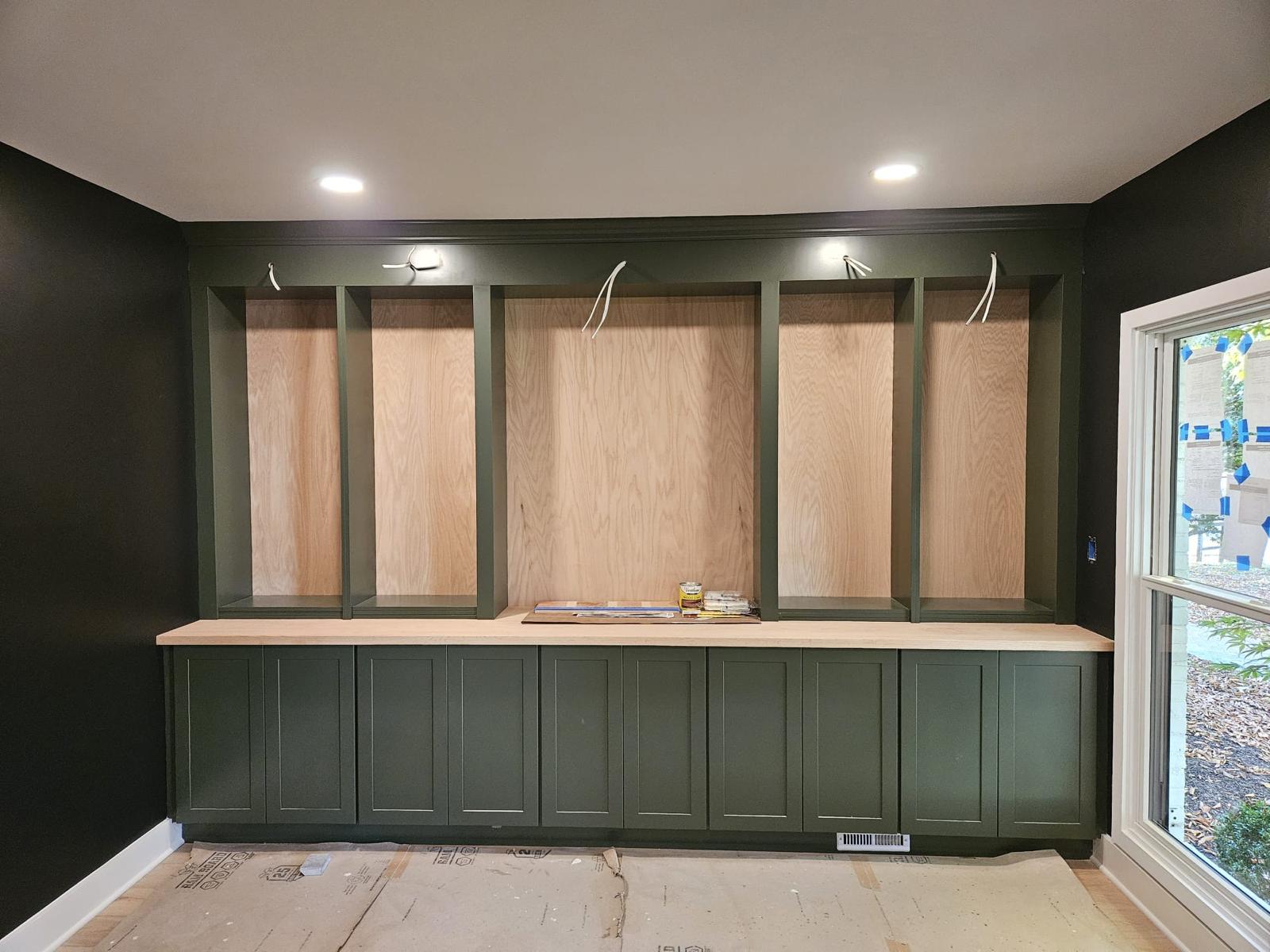
The office was designed around a symmetrical wall of built-ins. Closed base cabinets contain equipment and everyday supplies; open shelves provide room for books and objects. A wider central opening is reserved for artwork, giving the wall a clear focus rather than an uninterrupted grid of shelves.
Wood backs and picture lights add depth to the green cabinetry. The arrangement also creates a composed background for video calls, so the storage wall supports both the room’s practical work and the way it is seen from a desk.
At the foyer, the staircase connects the home’s traditional form to the updated interiors. Black handrails and slender balusters sharpen its outline, while the wood treads and lighter surrounding surfaces carry the material palette through the entrance. Updating this first impression helps the renovation read as a whole-house change as soon as someone arrives.
Before
After
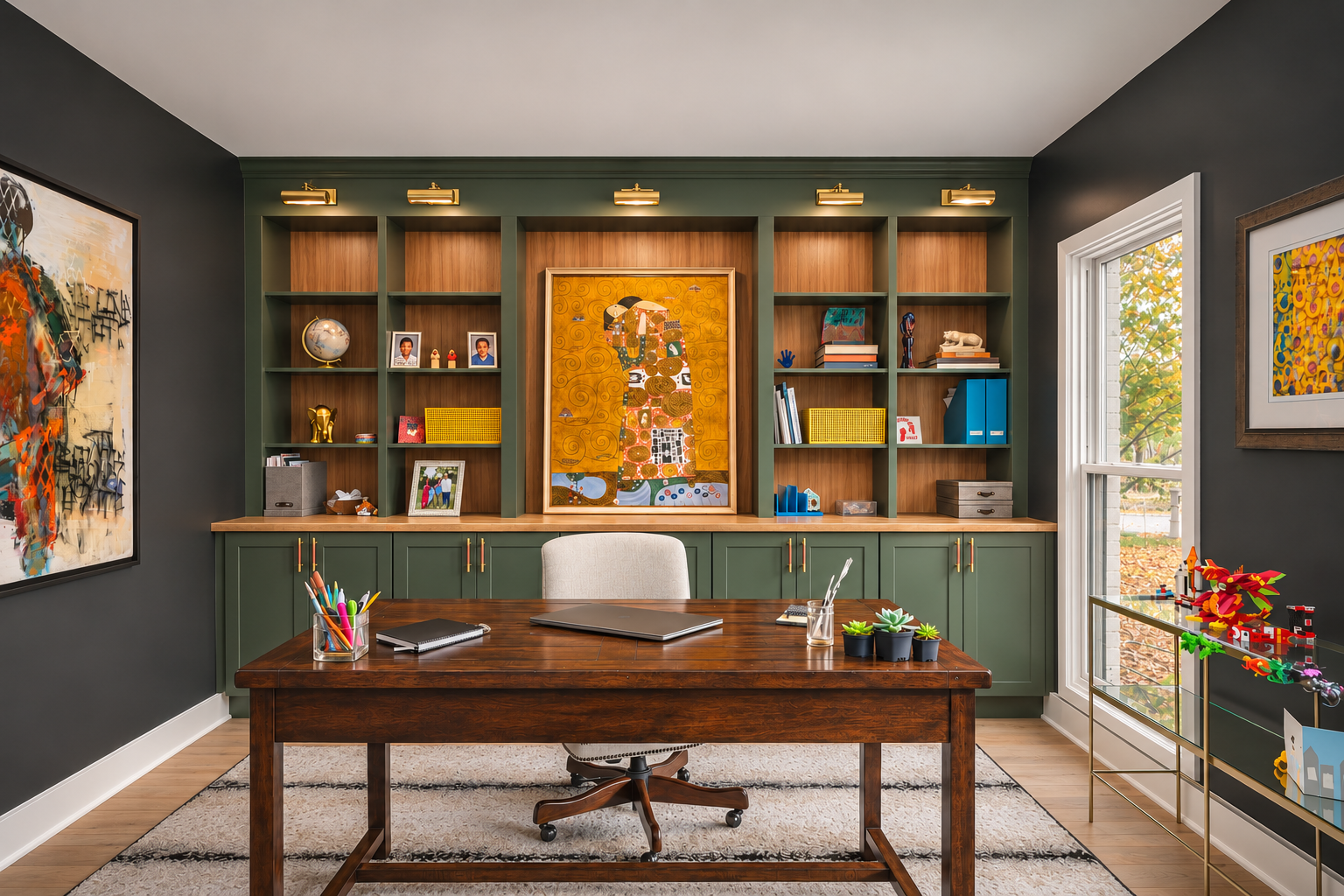
The same office is shown from different viewpoints.
During construction
Before

After
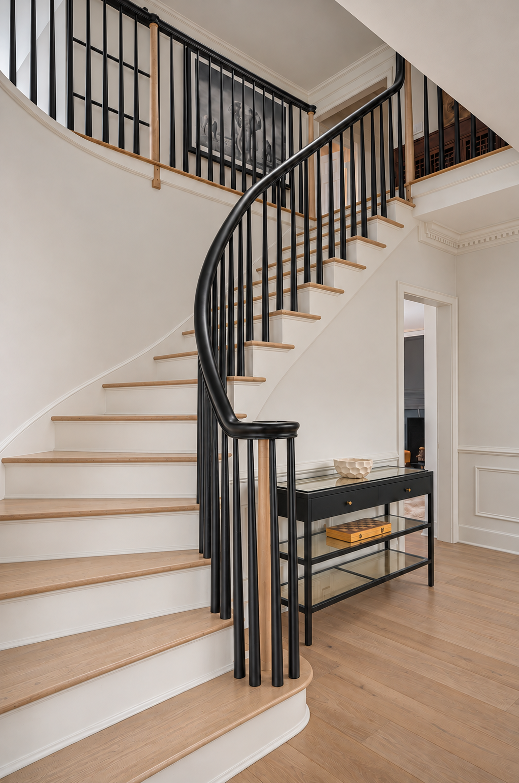
The foyer photographs show the same staircase from different positions.
Everyday arrival
Make room for coats, storage—and the dog.
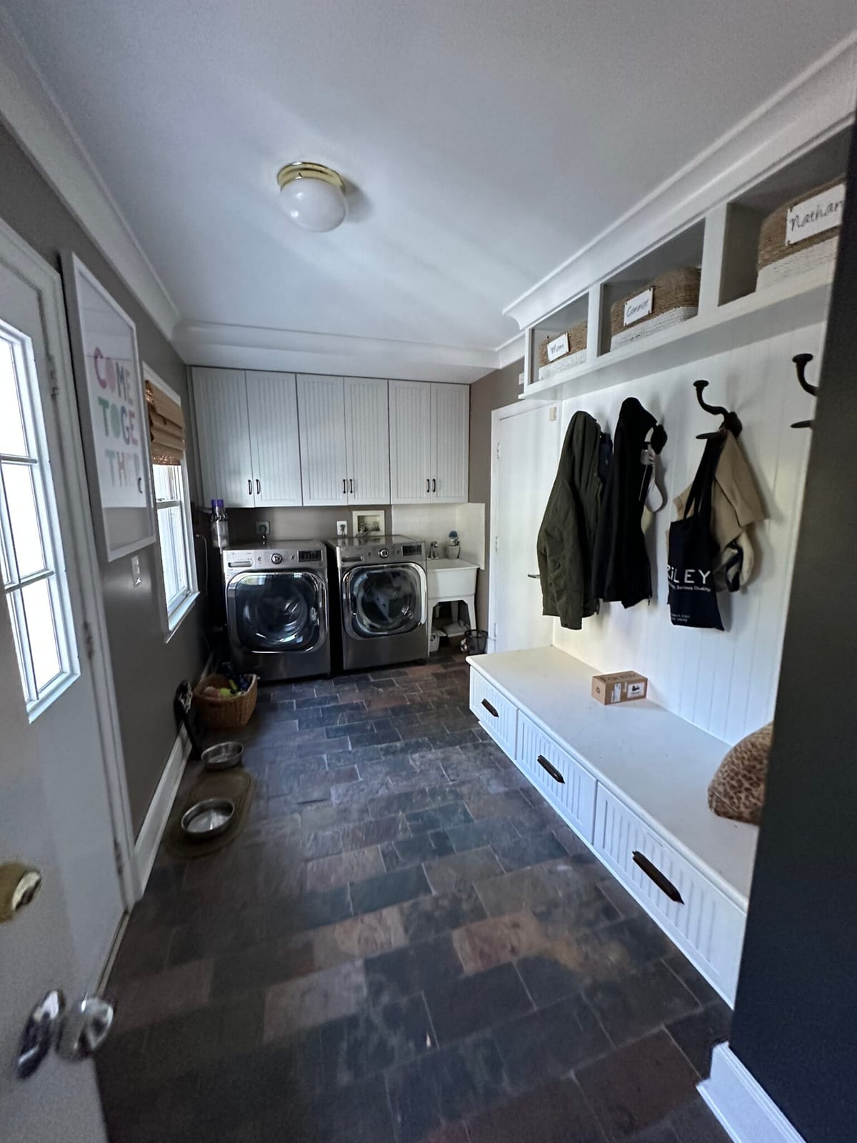
The garage entrance has a different job from the front foyer. Here, the design centers on the practical transition into the house: a place to sit, hang outerwear, put things away and wash the dog before moving farther inside.
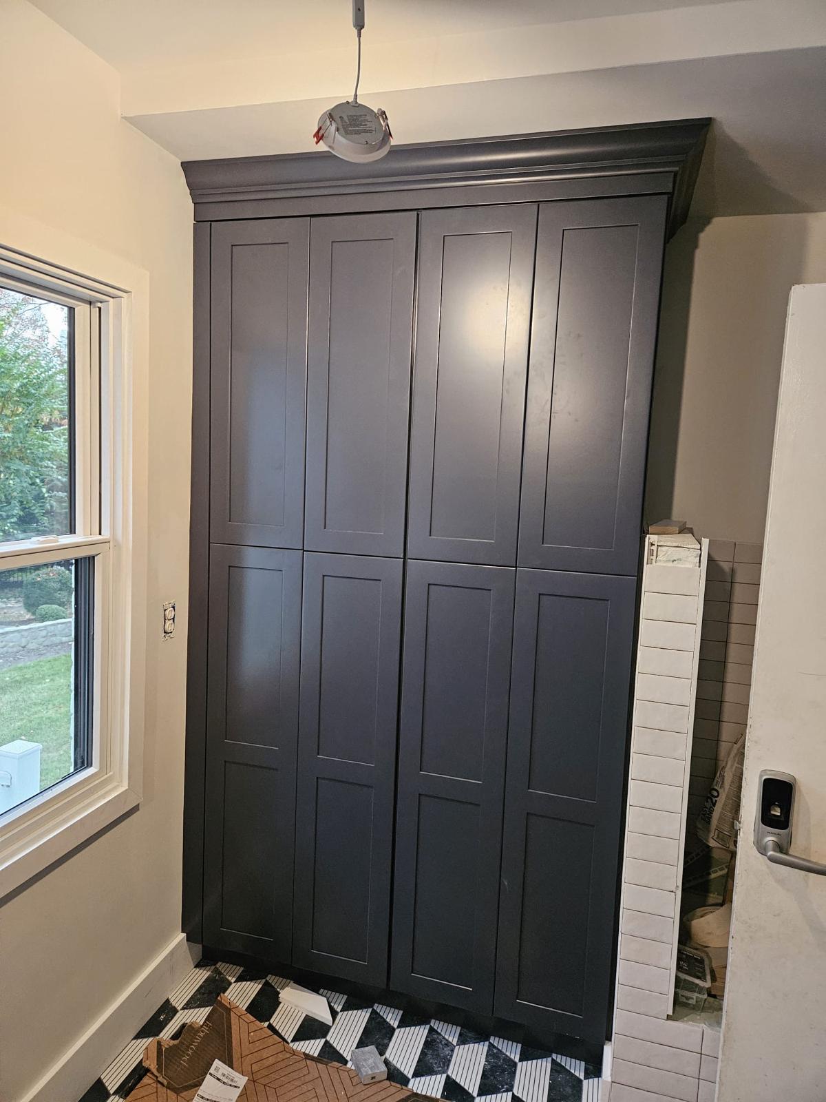
Deep blue cabinetry and a graphic floor give the mudroom a more playful character. Tall closed storage keeps the room organized, while the wood bench offers a place to pause. The tiled dog-wash station is integrated beside the cabinetry, making pet care part of the room’s daily function rather than an improvised task in another bathroom.
The original room also held laundry appliances. Creating a separate laundry upstairs allowed this area to become more focused on arrival and household storage. The two rooms are connected by that planning decision even though their finishes are deliberately different.
Before
After
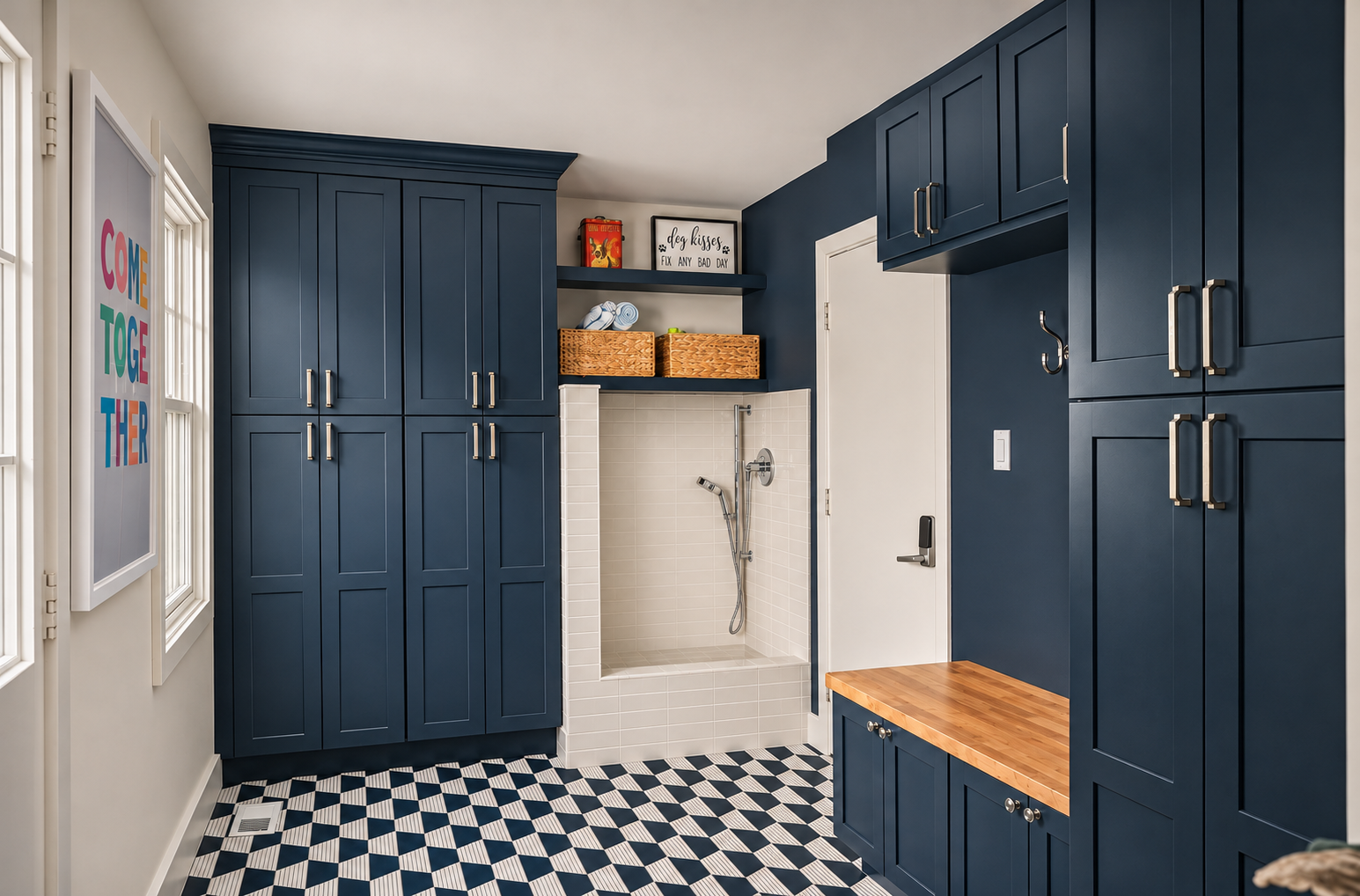
The same room is shown before and after, with the camera positions adjusted to reveal the changed functions.
During construction
After

The upstairs plan
Create a full laundry from a difficult arrangement.
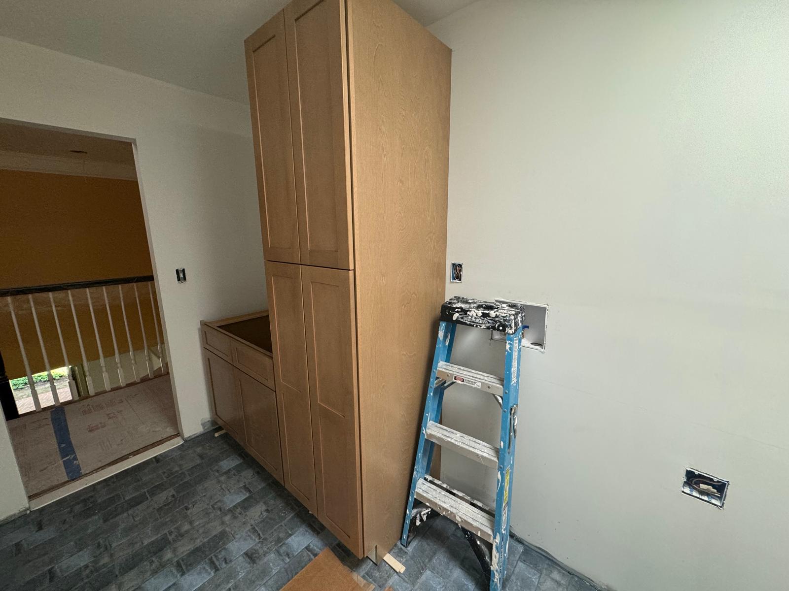
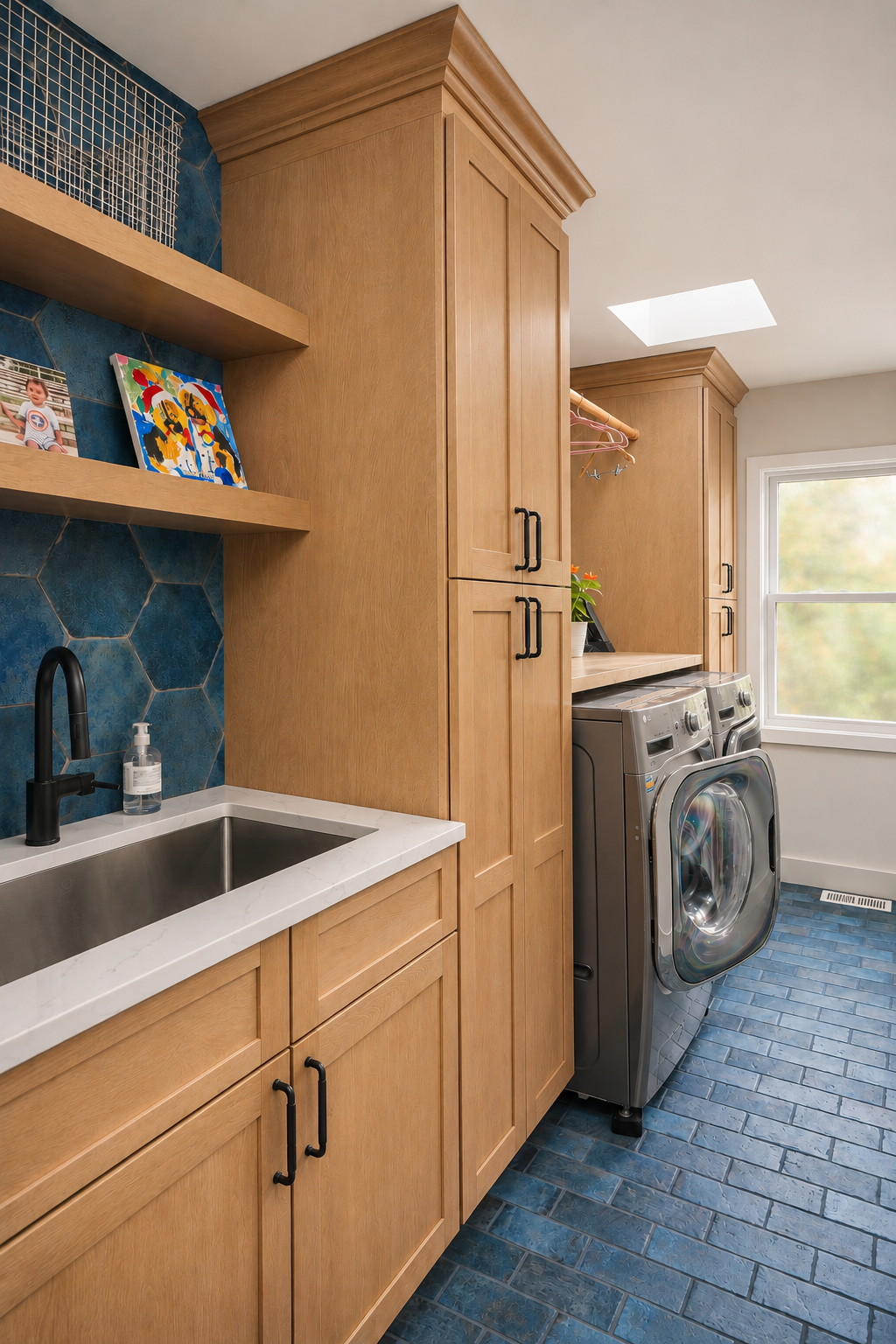
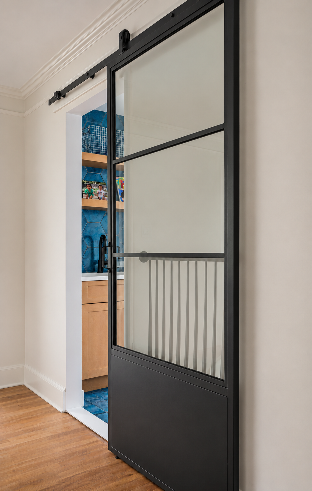
Upstairs, part of the former primary bathroom and a small hall closet were reorganized to make a linear laundry room. The new room accommodates a sink, washer and dryer, tall cabinets, a work surface and hanging space within one clearly arranged sequence.
Natural wood cabinetry brings warmth to the narrow room. Blue brick-look floor tile and blue hexagonal wall tile use the same color in different scales, allowing the laundry to have a distinct identity while continuing materials found elsewhere in the home.
The construction views are useful here because they show more than a change of finishes. The emerging corridor-like room, new cabinetry and plumbing positions explain how a small closet and part of another room became a purposeful space for washing, folding and putting things away.
During construction
After
After
The primary bathroom
Open the room to the trees.
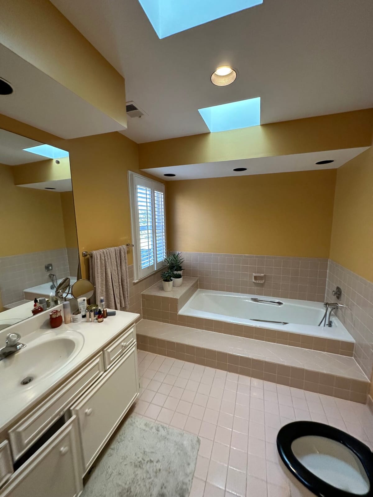
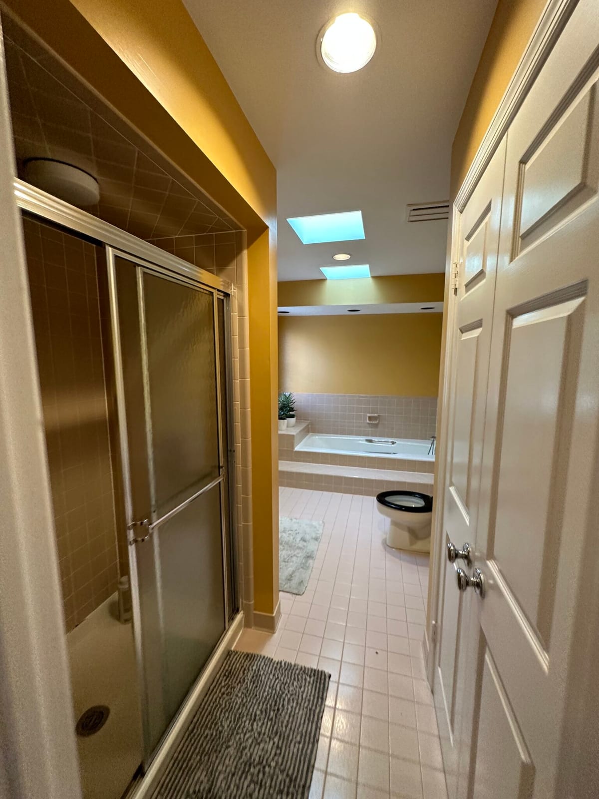
The original primary bathroom followed a long, narrow arrangement, with the shower and tub encountered along a largely one-directional route. Replanning this area alongside the new laundry created a more open bathroom with clearer places for bathing, showering and storage.
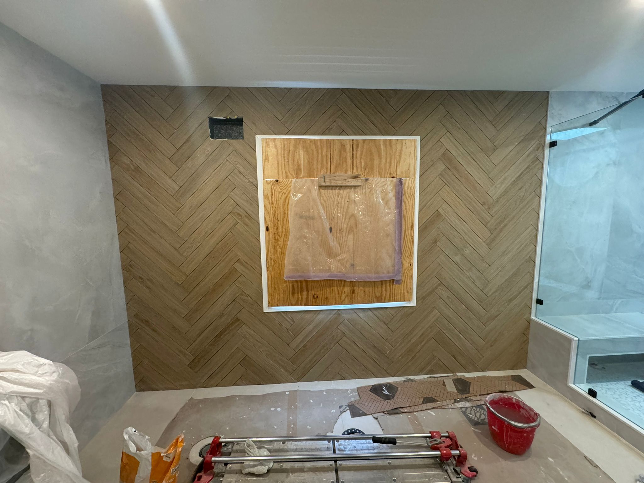
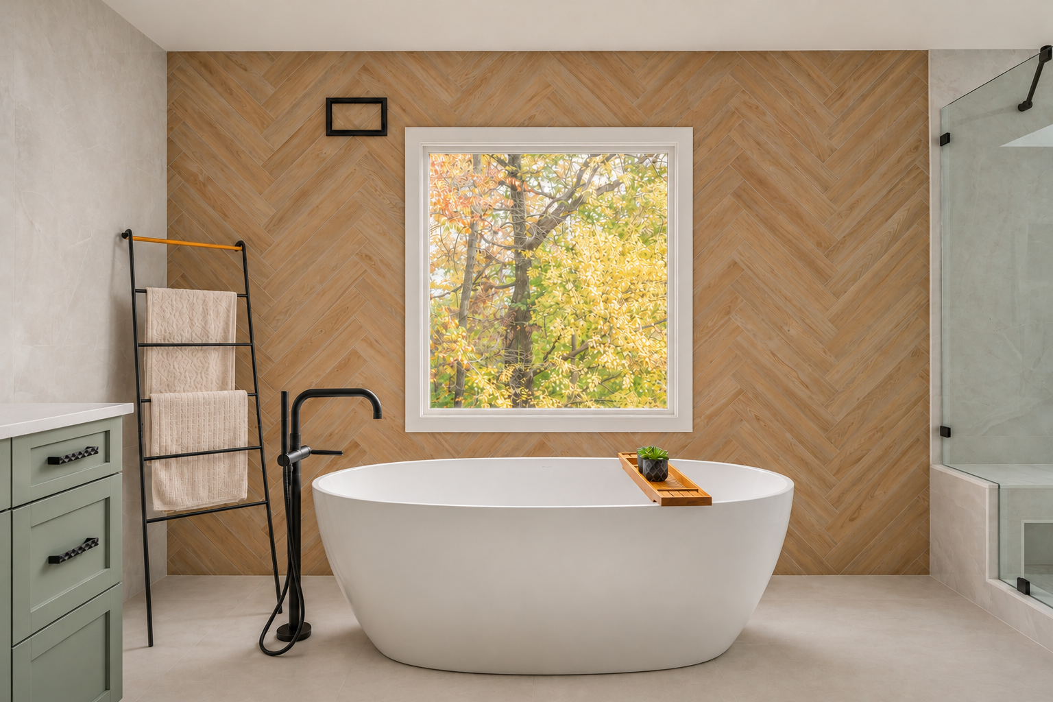
A large picture window changes the experience of the tub area. Instead of relying mainly on light from above, the room now has a direct view into the wooded garden. Wood-look tile laid in a herringbone pattern surrounds that window, carrying the warmth of the view into a surface suited to the bathroom. It is tile, rather than wood paneling.
The green double vanity offers a mix of drawers and sink cabinets. Three wall sconces place light nearer the mirrors and faces, while the pale countertop and wall keep this part of the room visually calm. The tub sits independently against the window wall, so the view becomes part of bathing rather than a background to a built-in deck.
Before
After
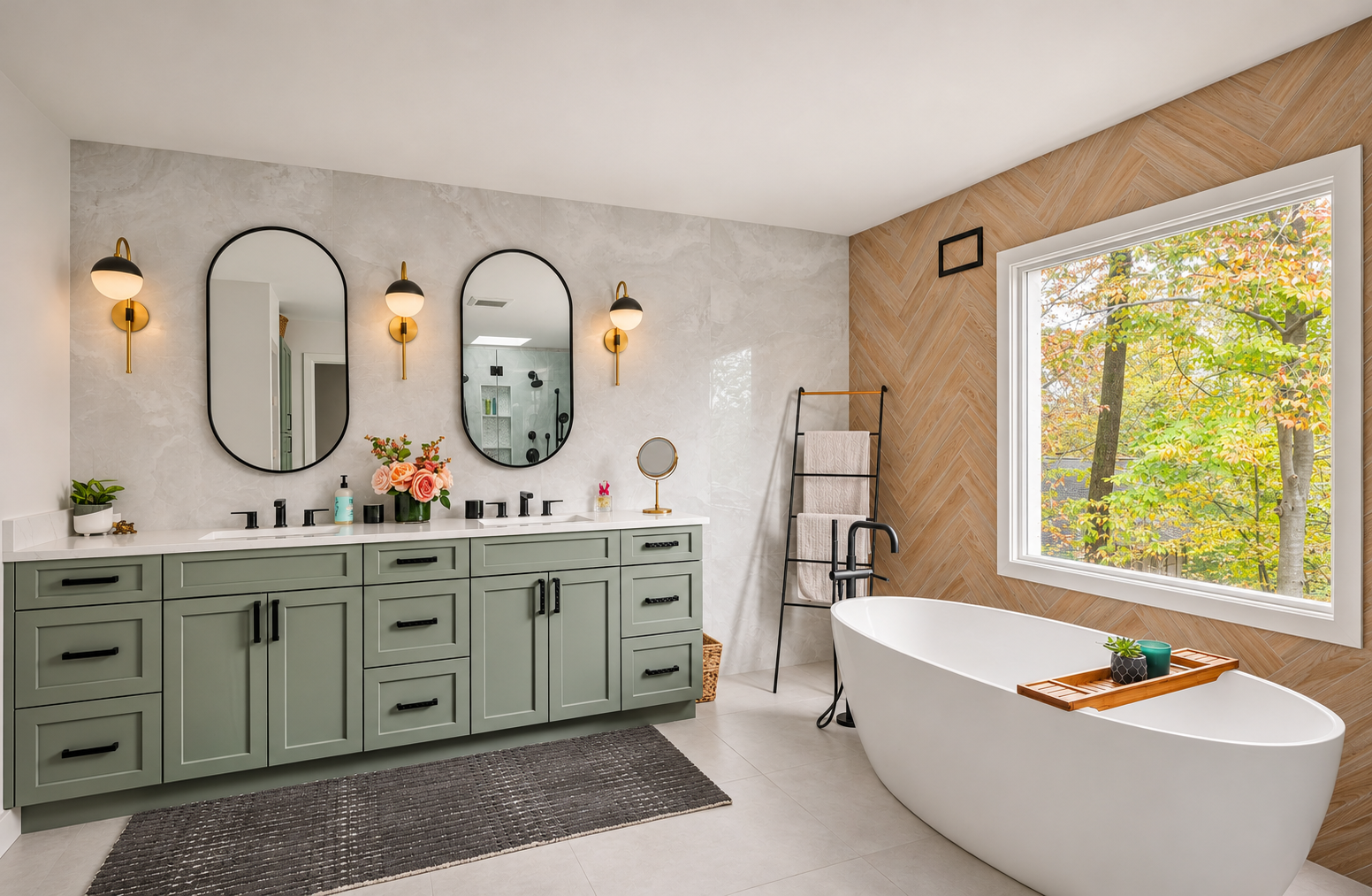
The layout and window openings changed, so these are related room views rather than an identical camera angle.
During construction
After
Details that support daily use
Balance openness with privacy and storage.
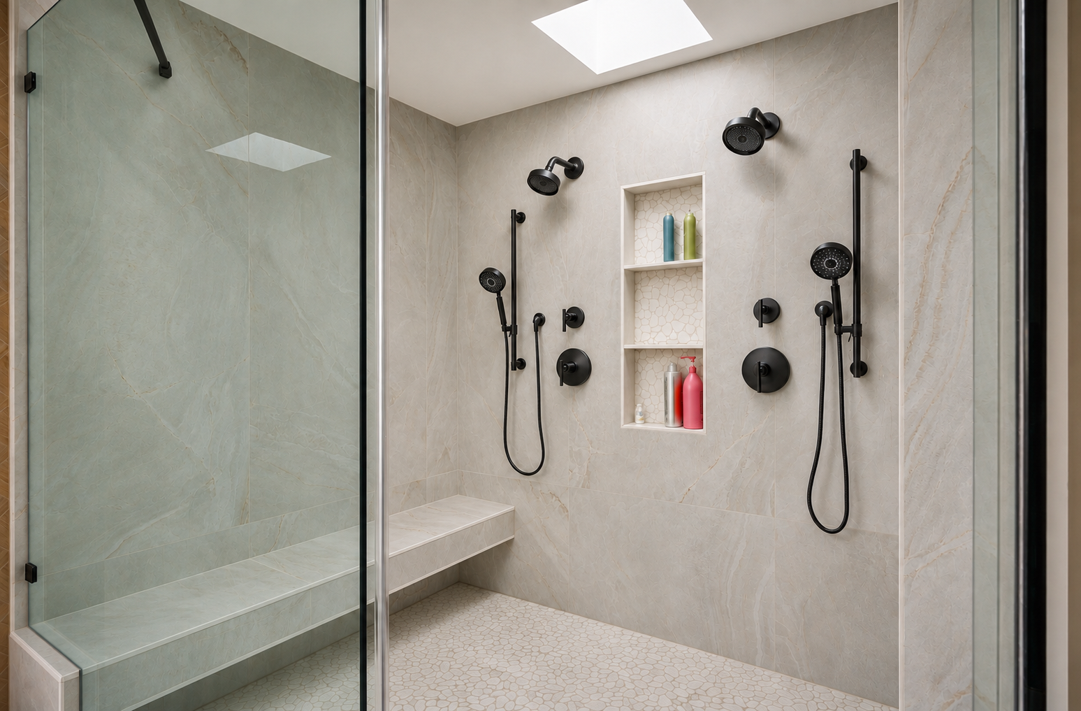
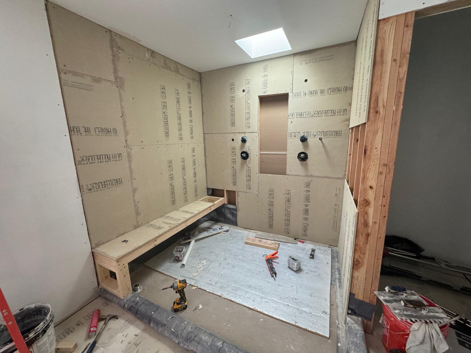
The shower has two separate stations, a central recessed niche and a long bench. Its glass enclosure allows the room to remain visually open, while the bench appears to float above the floor. The space underneath was intentional: it leaves room for feet when seated instead of bringing a solid base all the way to the floor.
Nearby storage has two roles. Open shelves keep towels within easy reach; tall closed cabinetry contains items that do not need to be on display. The recessed toilet room provides a more private position, and its frosted-glass door shares daylight with that enclosed area.
These decisions bring the larger renovation back to everyday use. Moving a kitchen, opening a structural wall and reorganizing a bathroom set the direction; the places to sit, store things, prepare a meal or hang clothing make the new plan useful. Each room has its own character, with daylight and repeated materials tying the house together.
Before
After
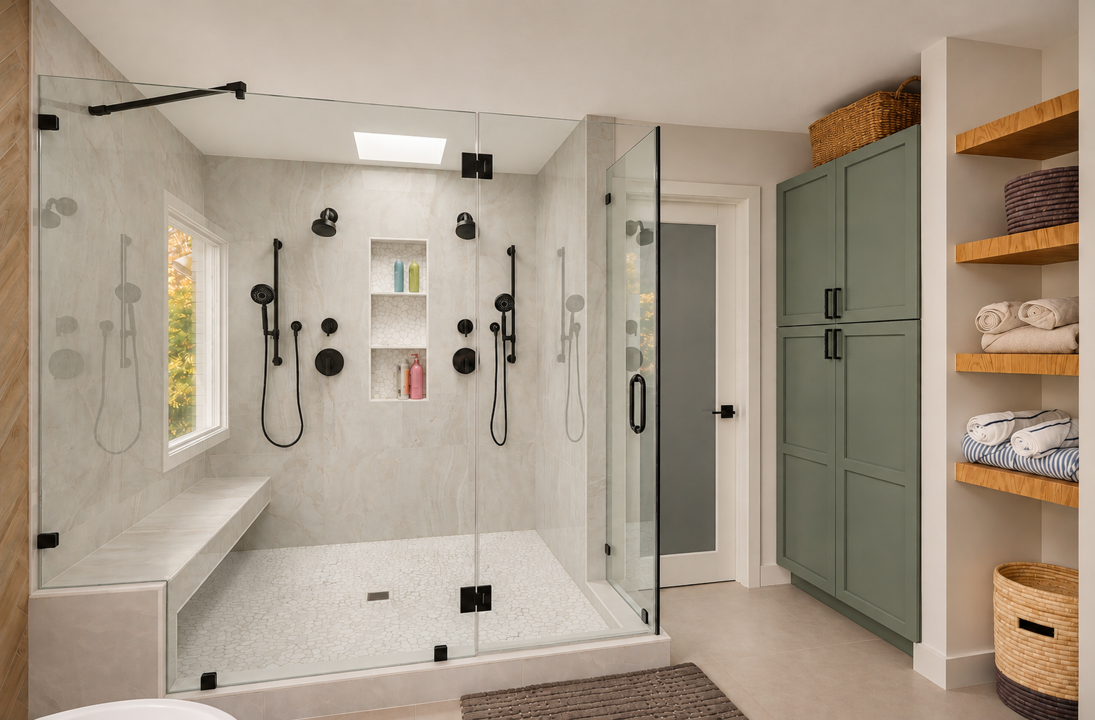
The before and after show the bathroom’s shower and circulation area after substantial replanning.
During construction
After